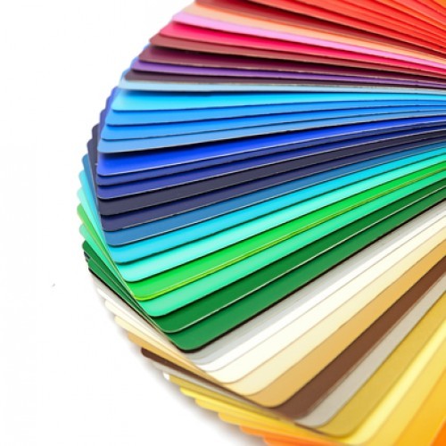
Image Source : Cut Sheet Labels
he right selection and use of the colors will add to the aesthetic and relevancy of your product. Imagine a retail product without a label.
It would be a guess-game to determine what that container contains.
Product labels tell customers about the product. This is why creating the right product label is a lot of responsibility. It makes all the difference to the success of an inventory, given how shoppers make their decisions about which products to buy in-store.
Color is one of the important factors to keep in mind while creating your product label. Colors can convey a message by influencing consumer’s emotions through a beautiful label. What do you think when you see the fire engine red of Coca Cola? Or how do you react when you notice the red-yellow logo of Burger King? While the vibrant red of Coke makes you feel happy and excited, the red-yellow of Burger King may stimulate your appetite. This is what experts called the emotional impact of the colors.
Therefore, you should be careful while choosing the color of your product label. And this brief guide will help you in this context.
Choose Positive Colors:
Colors trigger different psychological responses. Therefore, choose the color that is relevant to your brand. Here are some appealing colors along with their emotional impact.
- Green represents the environment and nature. It promotes relaxation and tranquility. The color is said to minimize blood pressure. You can consider green for your herbal or eco-friendly products.
- White symbolizes cleanliness, purity, and relaxation. It makes people feel secure.
- Black stands for wisdom, stability, and luxury.
- Blue is the color of serenity and happiness. It represents trust and reliability.
- Orange stands for hunger, adventure, and vitality. Self-confidence is also associated with this color.
Create Contrast with Legible Color Combination:
You need to choose another color to create contrast with your primary color. For example, you have chosen a green that should be combined with the contrastive color.
The key to successful pairing text and the background color is the contrast between lightness and darkness and vice versa. The more contrast you have, the more legible your text look. It also reduces eye-strain and makes your design look more pleasing.
You can use the color wheel to determining the best pair of colors. For example, you can choose a dark color from the bottom half of the when with a light one from the top.
Some successful pairings of the colors are…
- Black on Yellow
- Blue on White (vice versa)
- Green on White (vice versa)
- Red on White (vice versa)
Or it is better if you use an online tool to determine the right color combination.
Get Creative with Labels:
You can try various shades and materials for your labels.
For example, metallic labels are shiny and eye-catching. The silver and gold metallic labels minimize represent quality, making them the right option for your luxury product. Silver label symbolizes glamour and sophistication. Gold is the ultimate symbol of sophistication.
Fluorescent colors or neon are great for getting attention. If you want to create a happy and positive personality of your brand, these are your go-to colors.
What about those clear or transparent labels? They are a great way to facilitate openness and transparency while letting the appearance of your products do the talking.
So these are some points while choosing the colors for your label. However, it’s up to you to decide the look and feel of your brand. It is not required to be guided by traditional norms. Whatever you choose, make sure your product’s label looks appealing, visible, readable and relevant to the customers.


